About Hugosave
Hugosave is a fin-tech app that empowers ~100K Singaporeans to spend, save, and invest confidently & aims to make their Wealthcare journey easy-to-understand.
Why Redesign?
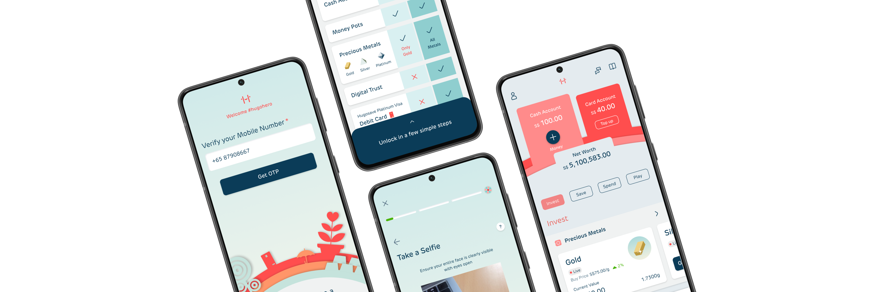
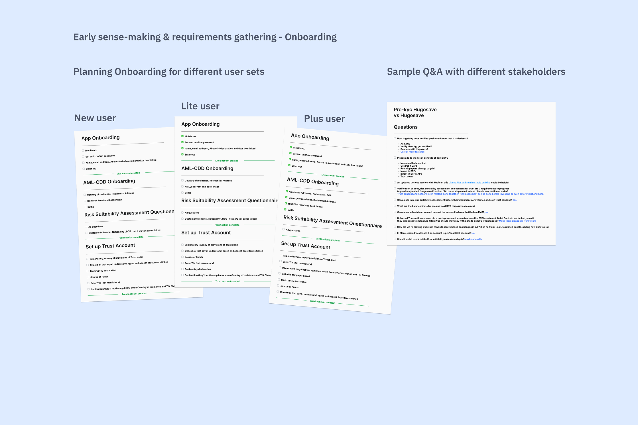
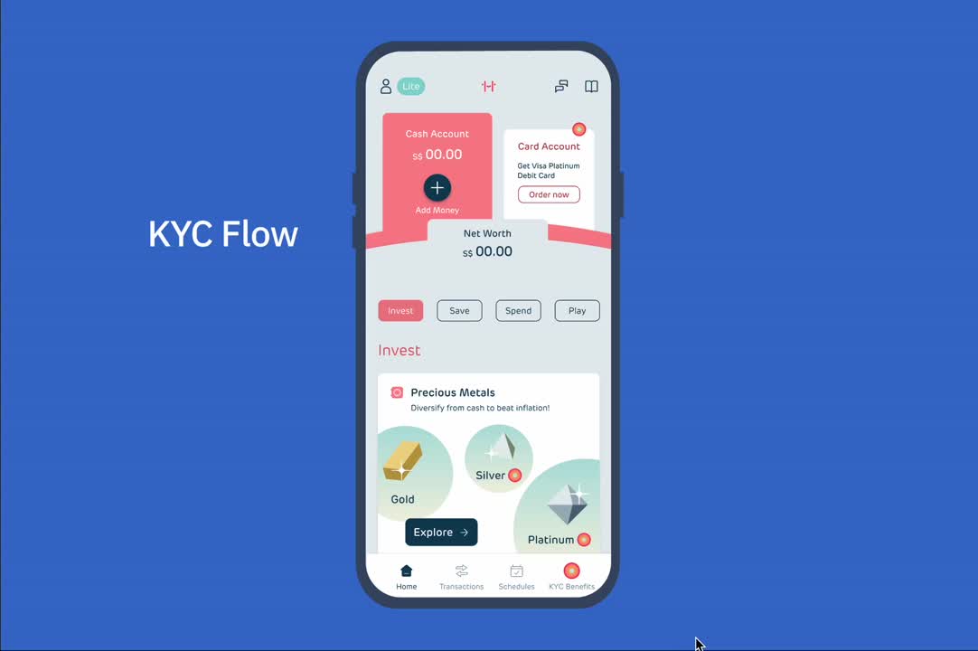
Onboarding & KYC
In 2021, Hugosave launched with a 23 step extensive onboarding with mandatory KYC. It created a major barrier for new users wanting to onboard. To address this challenge, 'Hugosave Lite' was introduced - a simplified version allowing users to experience core features before completing KYC verification for full account access.
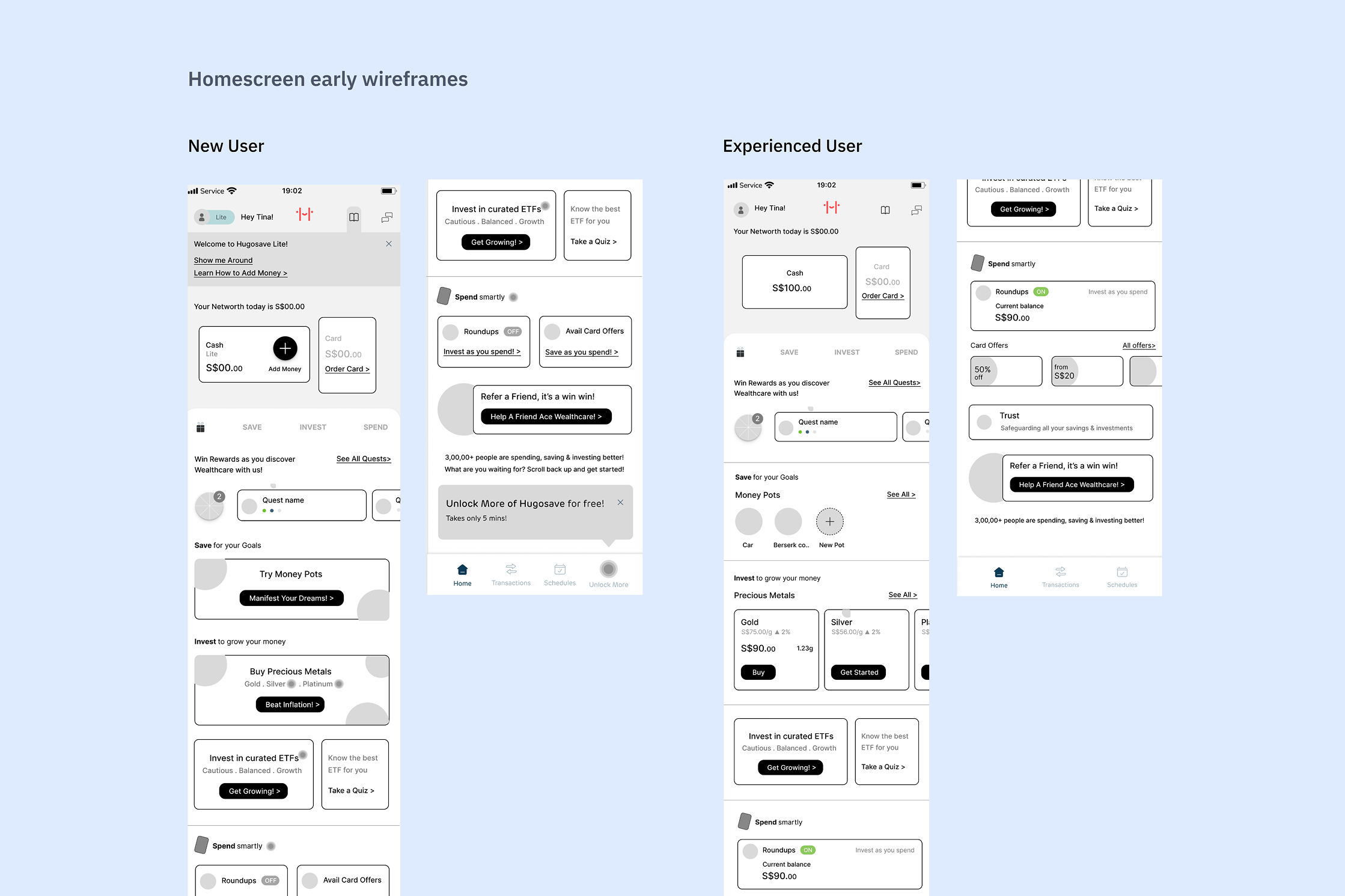
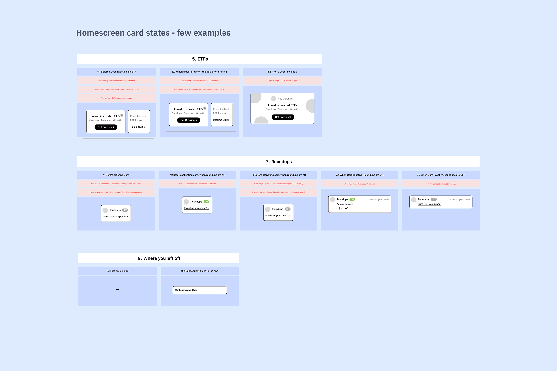
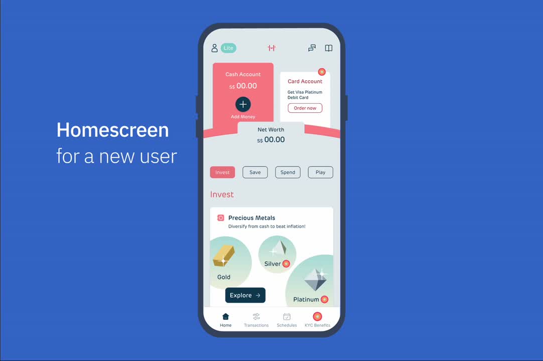
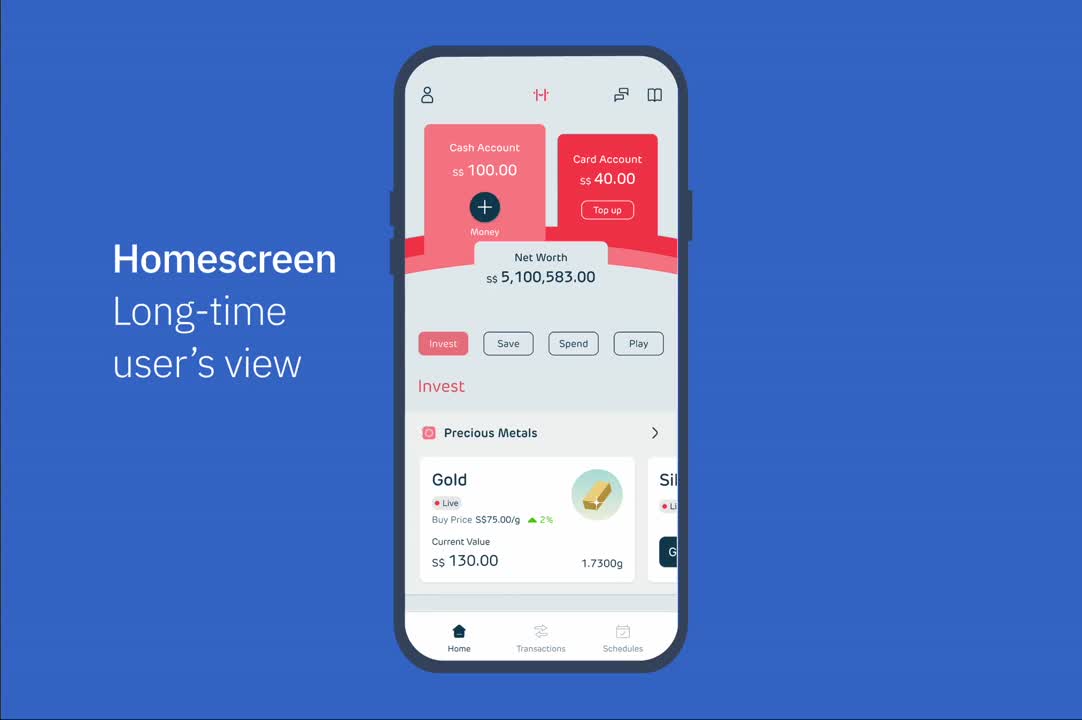
Homescreen
Additionally, the increased number of features during revamp and user feedback indicated that the home screen needed a strategic redesign.
For Whom?
Tech-savvy young professionals who expect quick value and have low patience for complex apps.
Key Behaviours
Wanderers : Browse to understand value, need clear feature discovery, quick to abandon if confused.
Hunters : Task-focused, prioritize efficient navigation.
The challenge was designing for both exploration and efficiency in one cohesive experience.
How?

Understanding Pain points
UX Audit, Customer Feedback, conversations with stakeholders
Requirements gathering
Collecting detailed inputs from Eng, CS, Compliance

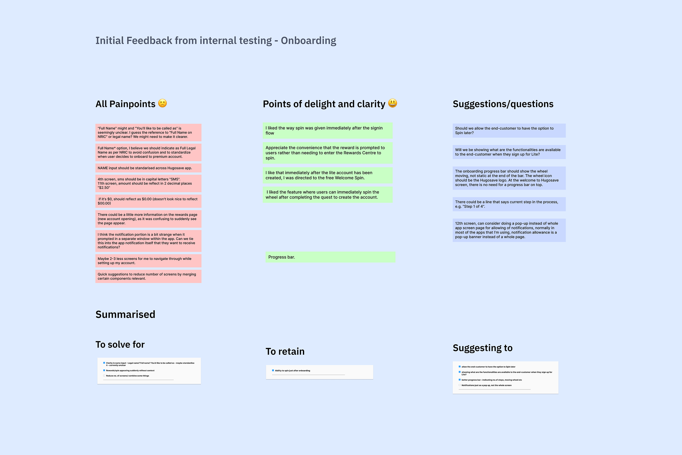
Ideation & feedback
Prototype & testing within company & colleagues’ friends
Solving for edge cases

UI & Frontend Collaboration
Helping visual designer
Dev Handoff
Testing & raising bugs before release.