Gold Investment Revamp, 2022
Team
1 UX Designer, 1 Visual Designer & Design Lead
Scope
UX Design, Product Requirements Gathering
Time
4 months
About Hugosave
Hugosave is a fin-tech app that empowers ~100K Singaporeans to spend, save, and invest confidently & aims to make their Wealthcare journey easy-to-understand.
Why Redesign?
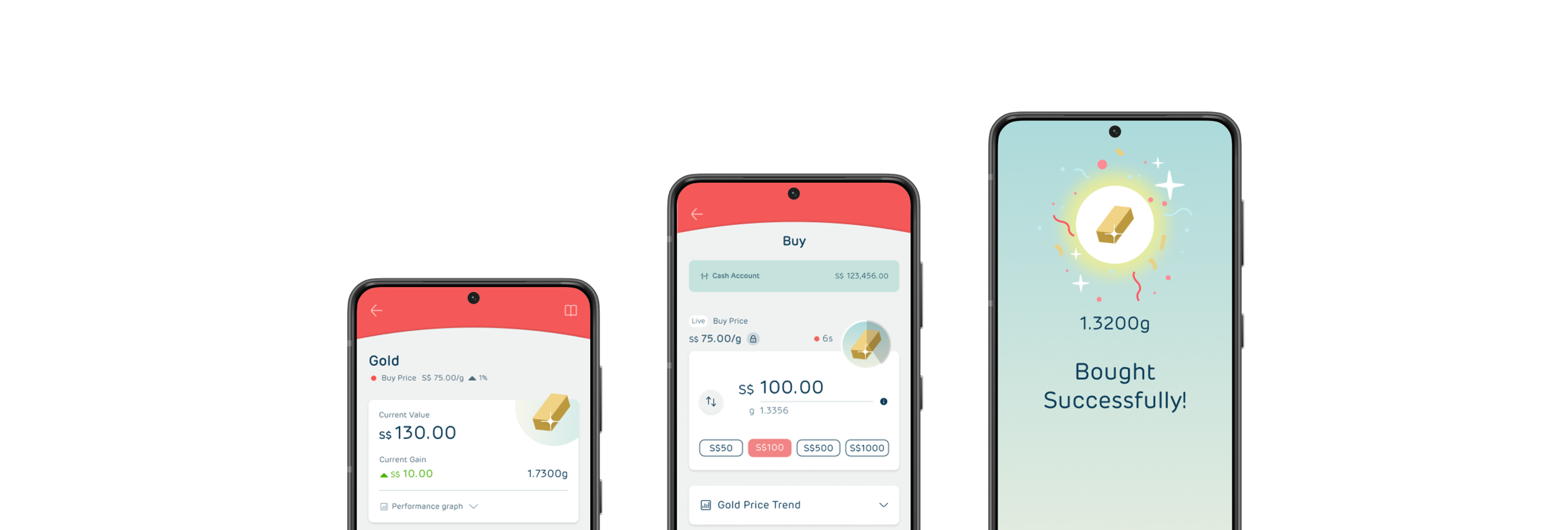
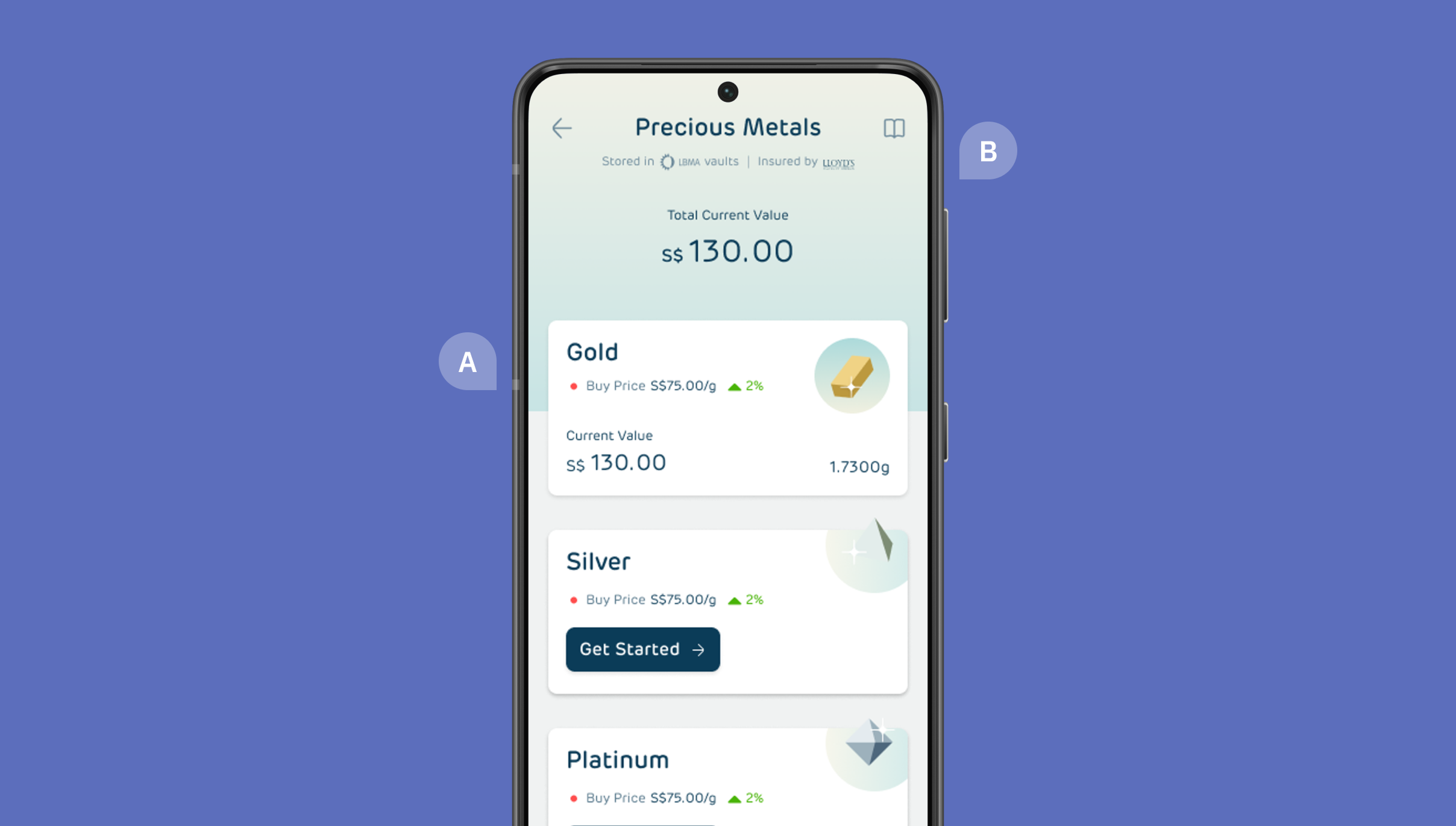
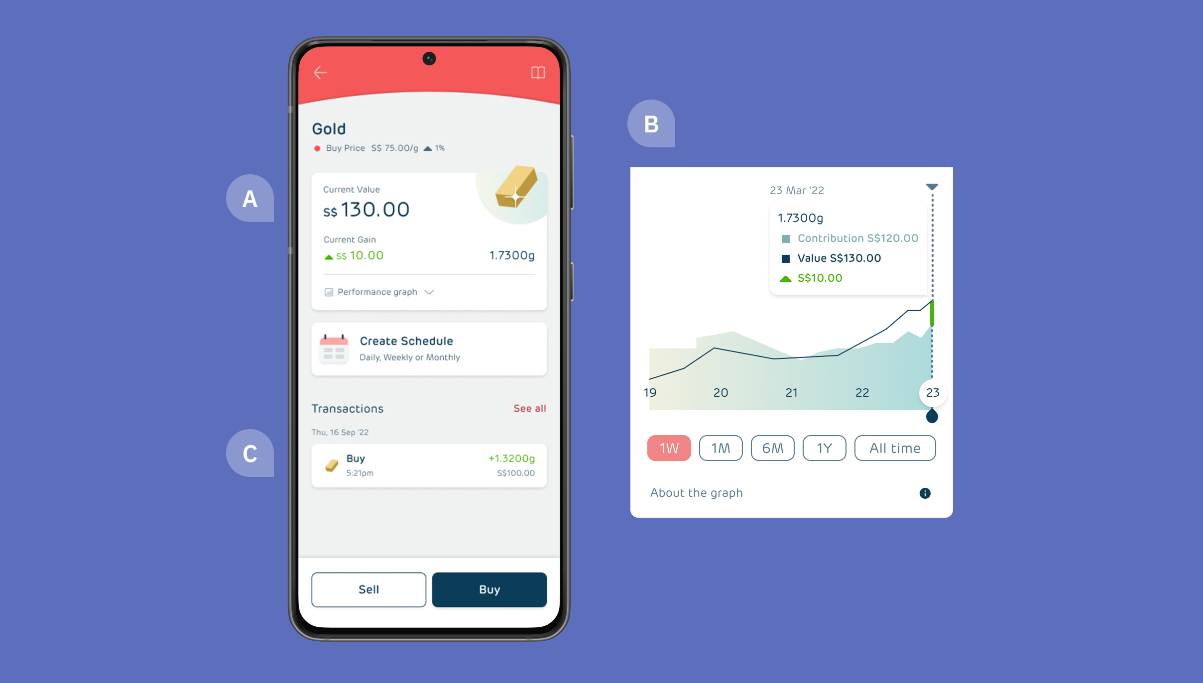
When I joined, they were one of the first apps in SG to democratise gold investing & had plans to expand into silver and platinum investments. To support multiple metals and address user feedback on the existing experience, app’s interface needed to be reimagined and enhanced. A wider visual revamp & introduction of new features like ETF portfolio investments were being undertaken parallely.
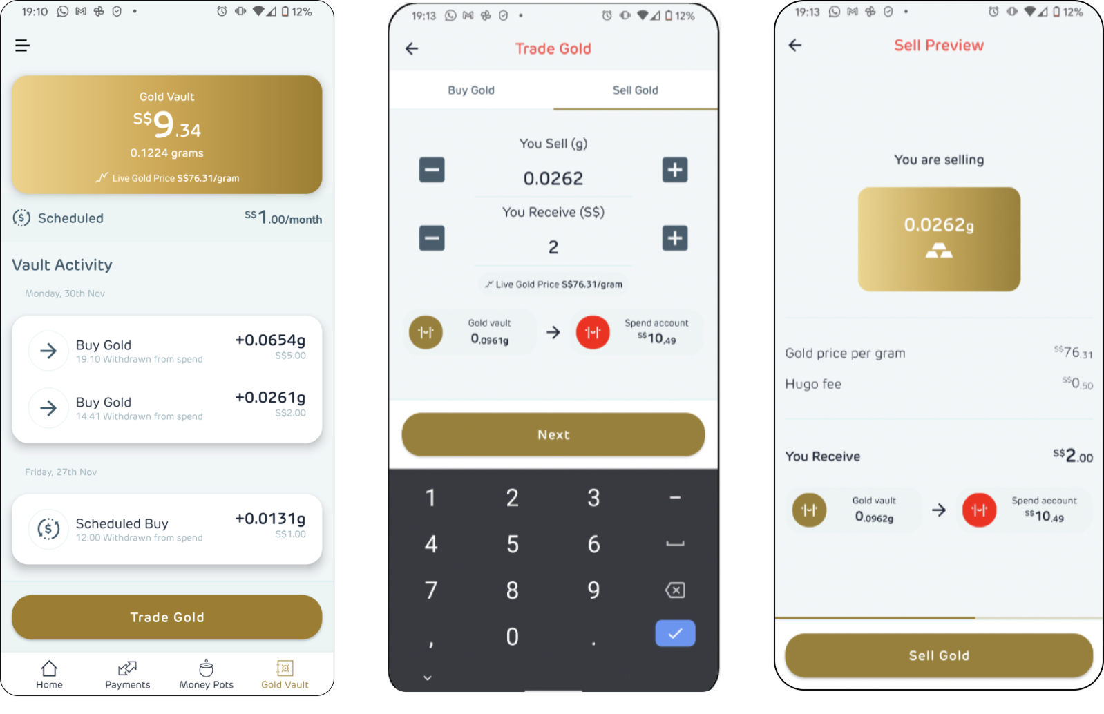
Before Redesign
For Whom?
New entrants to workforce who are tech-savvy, have low financial literacy & they wish to take informed financial decisions independently.
How?
P.S : Streamlined for sanity here, powered by chai, chaos, and eventual clarity!
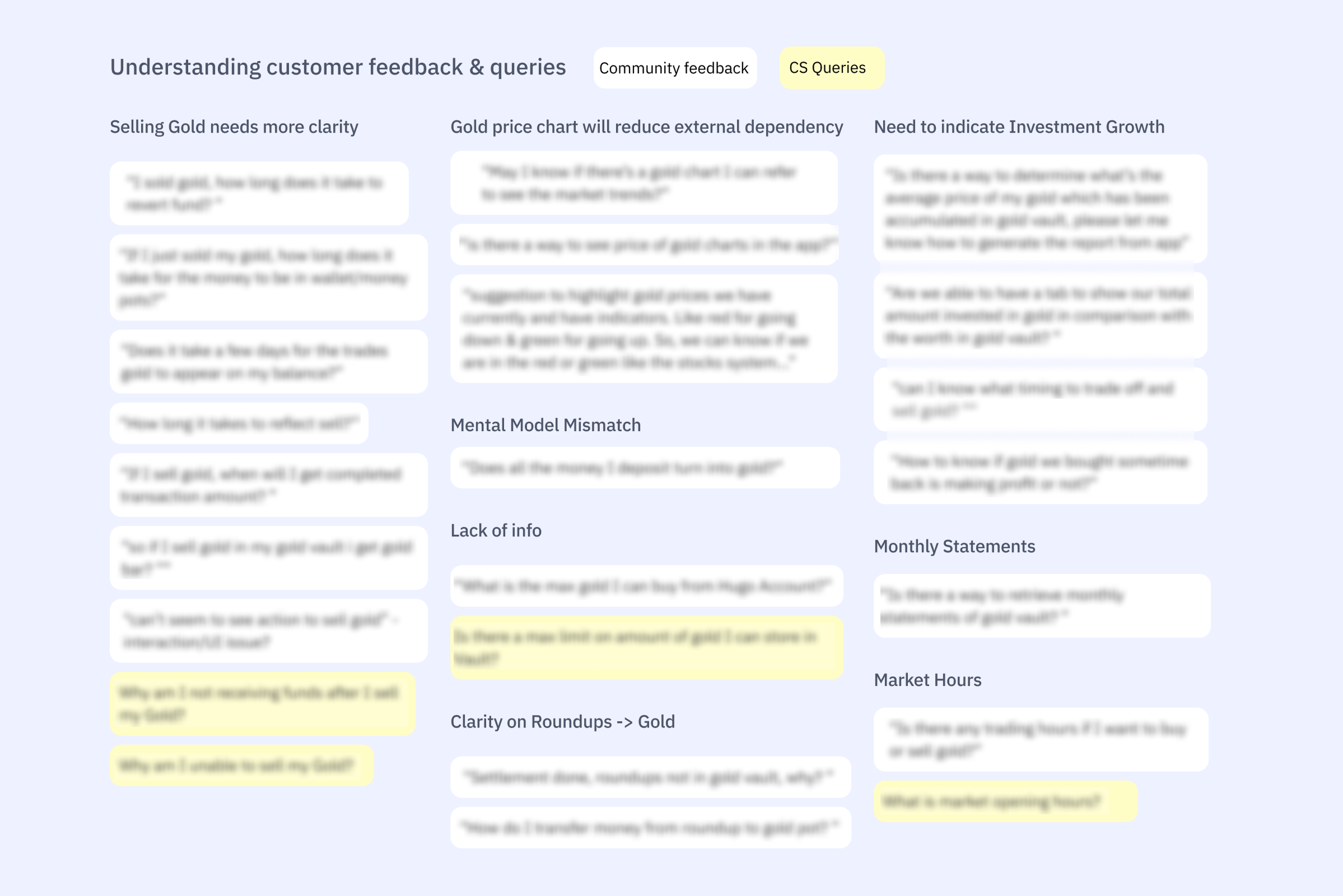
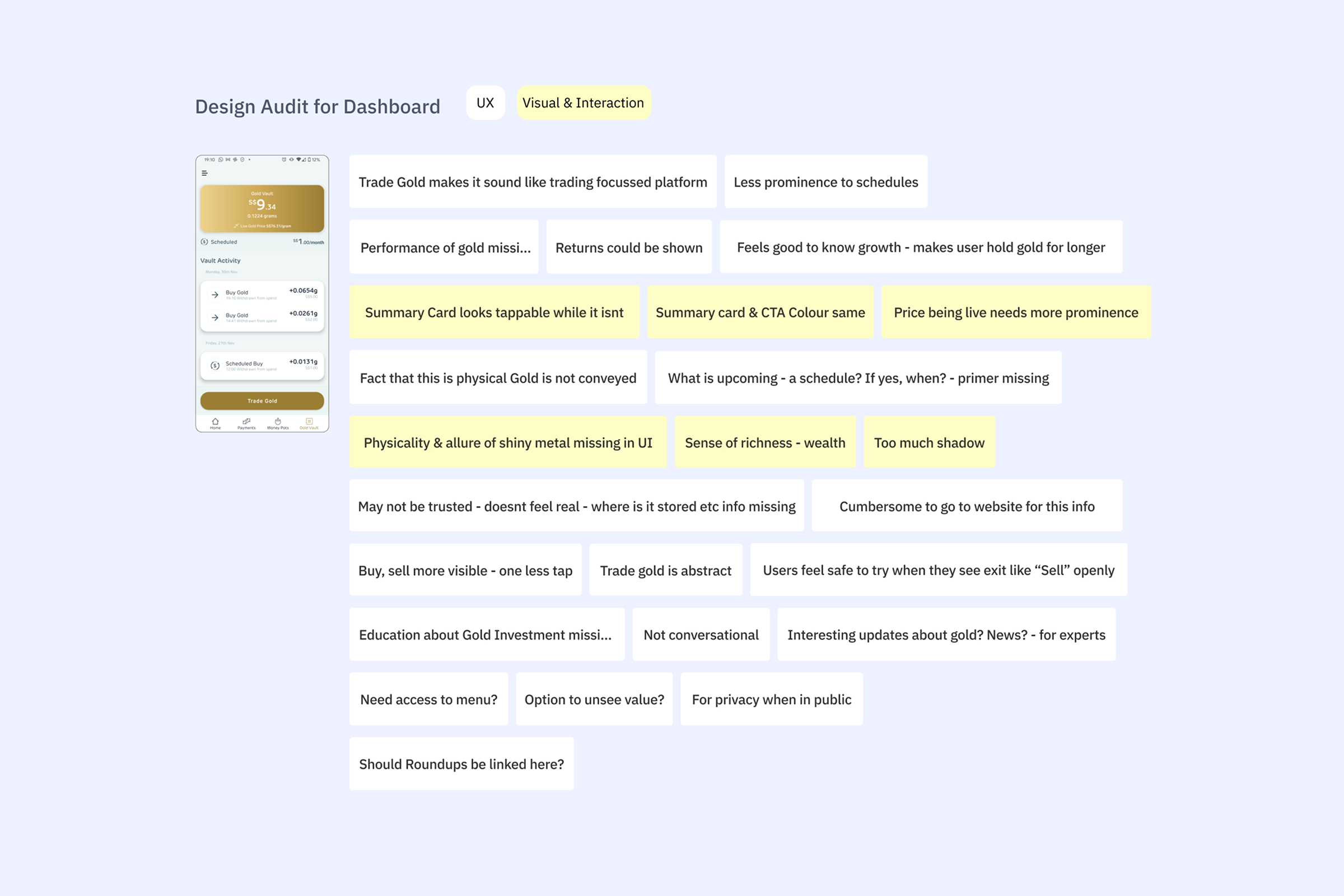
Understanding Pain points
UX Audit, Customer Feedback, Previous interviews analysis

Finalising areas to improve

Stakeholder Alignment with CPO, Eng, CS, Compliance
Ideation & feedback

Prototype & testing
within company & colleagues’ friends

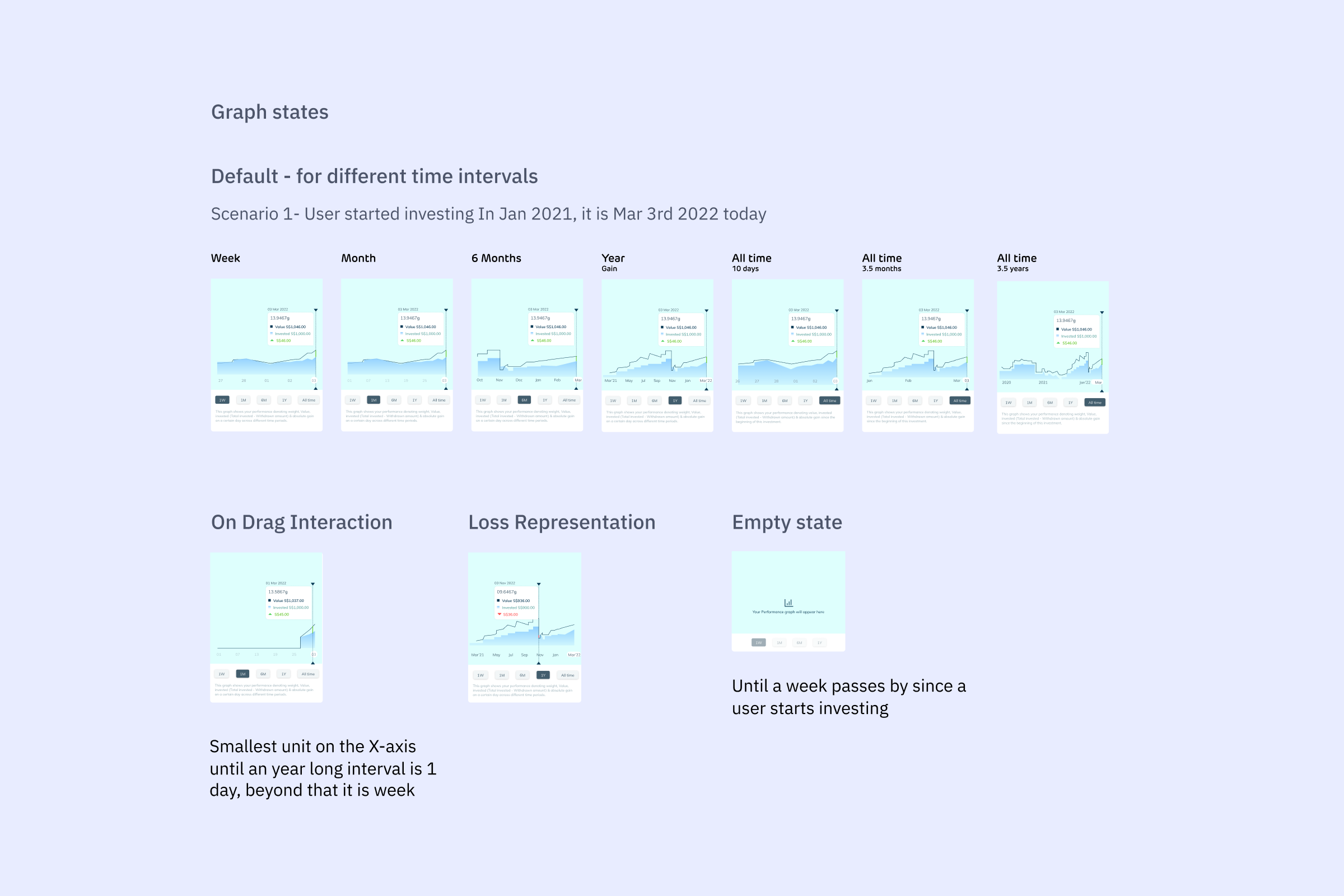
Solving for edge cases
UI & Frontend Collaboration

Helping visual designer
Dev Handoff 

Testing & raising bugs before release.

Understanding Pain Points
Process involved a design audit and direct user feedback from customer support logs and Telegram communities to identify pain points, generating actionable insights despite resource constraints for full fledged research.
Key insights
Help improve users’ financial literacy
App lacks relevant information to make informed buying & selling decisions for metals. Missing beginner-friendly guidance for metal investing & a chance to improve users’ financial literacy.
Gain user trust
Lack of clarity may lead to mistrust - For example, settlement time after sell is unclear, clarity in transaction summary could be improved wrt fee, status of transaction etc.
Motivate users to stay invested
The app can do better to encourage users for long-term investing, aligning with product vision & cultivating good financial habit of investing
“little, often & early”
Improve interaction & navigation
Overall navigation and interaction patterns for amount input during sell & buy can be better
Process SNAPSHOTS
Redesign Highlights
1. Sell metal journey
Metals Overview
A. Compare metal prices at a glance in overview stage to make informed investment decisions.
Improves users’ financial literacy 💸
B. Display storage location and insurer names prominently to build trust and confirm users are purchasing actual physical gold through verified partners, this was missing in the earlier version of the app.
Gaining User Trust   🤝
Metal Dashboard
A. Summary Card with clear gain & value of holding, gain in absolute numbers clearly shows growth.

B. Interactive performance graph visualises growth while staying collapsed by default to avoid overwhelming new users. Handles all scenarios: loss, metal sell and multiple time periods - users naturally develop long-term perspective through the time period change from 1 week to 1 year etc.
Motivates users to stay invested 🪴
C. The Recent Transactions section displays transaction details in dashboard immediately after submission, keeping buy and sell amounts visible during processing before they're reflected in the account total.
Gaining User Trust   🤝
Sell Metal
A. Account and vault balances are displayed at the top during buy & sell, helping users decide how much to buy 
or sell.

B. Metal price trend helps users make informed buy/sell decisions based on past metal price trends, without leaving the app.
Improves users’ financial literacy 💸
C. Flexible input options for weight or value, with value (S$) as the default since it was found that most users prefer entering amounts in dollars.

D. A prominent timer shows when gold prices refresh every 15 seconds, so users know when price changes are expected updates rather than app glitches.
Improving Interaction & navigation 👆
Sell Metal Preview & Success
A. Clear transaction preview with detailed, transparent fee breakdown, redesigned to support other app features beyond just metal buying & selling.

B. Shows how long settlement takes - this was one of the most asked questions in the community.
Gaining User Trust   🤝
2) Buy Metal Journey - Demo Video
Post Metal Buy
Introduction to automated savings schedules as a nudge post first buy to encourage consistent investment habits and build financial discipline.
Motivates users to stay invested 🪴
Impact
Usability tests found that 1/3rd of users interviewed after the revamp named Metals investing as their favourite feature 💛
Released in Oct’23 with other redesigned features, Appstore ratings has gone up from 
3.2 ⭐ → 4.3 ⭐
Usability TEST Feedback
- On Interaction : S$ to Gm switch being missed by few users - this interaction can be made more prominent
- On Visual Design : Some users found the “live timer” a little stress inducing - could represent it better & help users understand its purpose clearly.
- On Buy/Sell Journey : Placement of both Performance & Metal Trend graph in the journey can be better - as some users preferred to see the metal trend graph even before taking a call on either buying or selling a metal.
Key Takeaways
Collaboration
First full feature UX responsibility. It was great to collaborate & learn from CPO, Eng, CS, compliance and other teams to gather insights, prioritise right problems & drive impactful product improvements.
Solving for trust
Learnt the importance 
of handling every edge case, like transaction processing, 
& focusing on details, like metal purity, to improve trustworthiness of a fintech app.
Data Visualisation
Researching and implementing interactive data visualisations was a valuable learning experience in both design and technical feasibility.
Thanks for stopping by!
Up next
Dive In!
Onboarding under 60 secs, 2023
Streamlined from 23 steps to just 3. Take a look!